


Share This Post:
As an elementary teacher, you know that sometimes the tiny details make all the difference when it comes to setting up your classroom and teaching materials.
Have you ever thought about how font pairing and typography can take your documents from “meh” to marvelous?
Here on this blog post we will cover some font pairing tips and typography tricks so that you can create stunning parent forms, captivating permission slips, fun TPT resources and anything else related to your classroom or business!
What is typography?
Typography is the style or appearance of text, and it’s something you see everywhere – clothes, different brands, commercials, and many other products.
What is a font?
A font is a set of displayable typography in a specific style or size.
What types of fonts are there?
There are 3 main types of fonts:
Serif fonts
Serifs are the little tails you see on the ends of letters. These types of fonts are great for print items like newspapers, and they also have a classic look. Examples of these types of fonts are Times New Roman and Playfair Display.
Sans-Serif fonts
Sans-Serif fonts are more rounded and modern. They are much easier to read on digital products and computer screens. Examples of these types of fonts are Calibri, Century Gothic, and Poppins.
Display fonts
These fonts come in a variety of styles and can resemble a handwritten look (both print and cursive). They are the types of fonts you may see on TPT resources. A lot of font artists such as KA Fonts, KG fonts, and PB fonts are all display fonts.
How to Choose the Right Fonts
Choosing the right fonts depends on who your audience is and what your message is.
If you’re writing a letter to third grade students, it’s probably at best to avoid some type of super cute cursive script fonts because students will most likely not be able to read it.
If you have some type of serious disciplinary letter or serious referral with bad news, you probably want to avoid some type of fun and lighthearted font. Your fonts need to match what you want to communicate.
Font Pairing Tips
It can be hard to figure out and navigate which fonts go well together, which fonts to avoid, and which fonts clash. Here are a few simple tips that you can take away and use right now if you are creating something for your classroom or if you’re creating TPT resources.
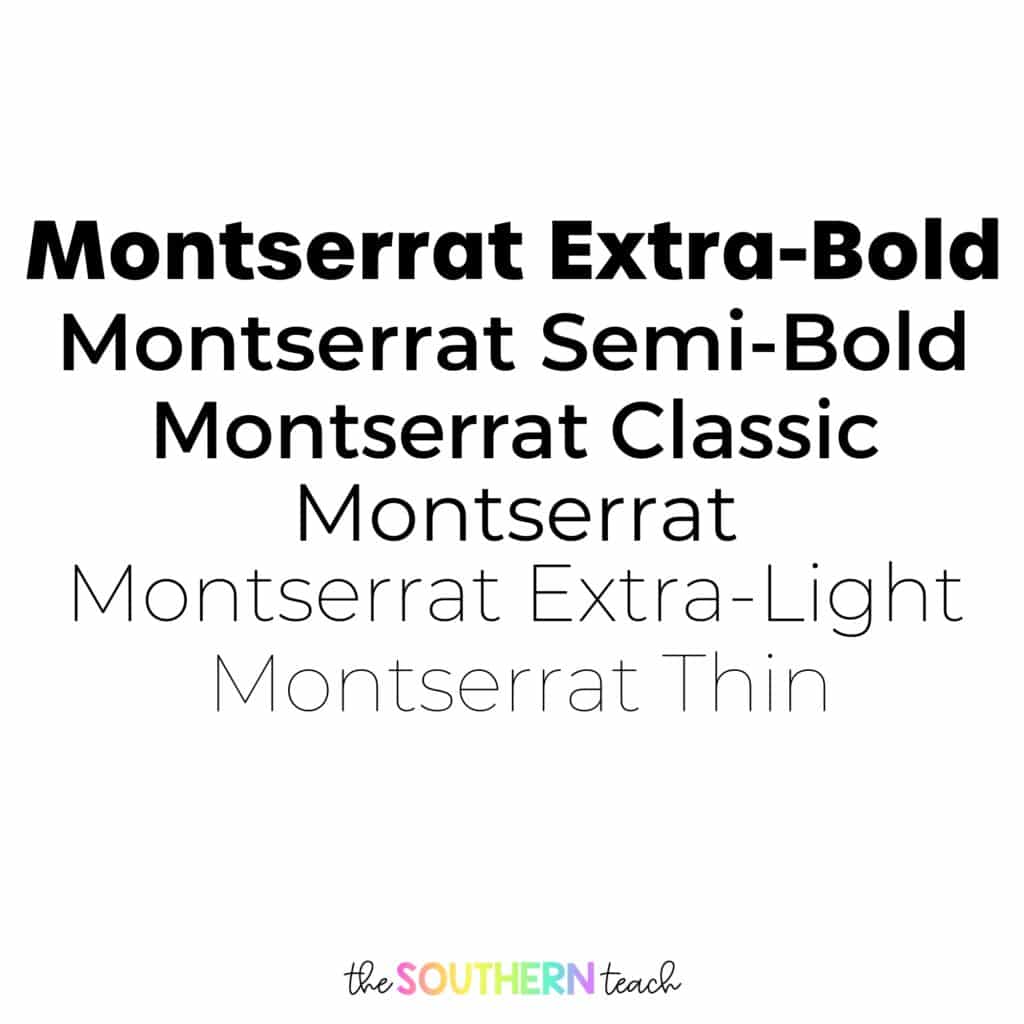
1. Use font families.
Font families are your friends! Font families are typefaces that range in weight, from very thin to super bold and think. Montserrat is an example of a font family.
It’s easy to pair a bold heading with thinner body text when you find font families. If you want to use the same font in a resource or document, this is a great way to separate heading and body text – just use different font weights and text sizes!
2. Use no more than three fonts.
Another font pairing tip would be to limit to no more than three fonts on one resource or activity. Less is more! Your design may end up looking too busy. This can confuse or distract your intended audience.
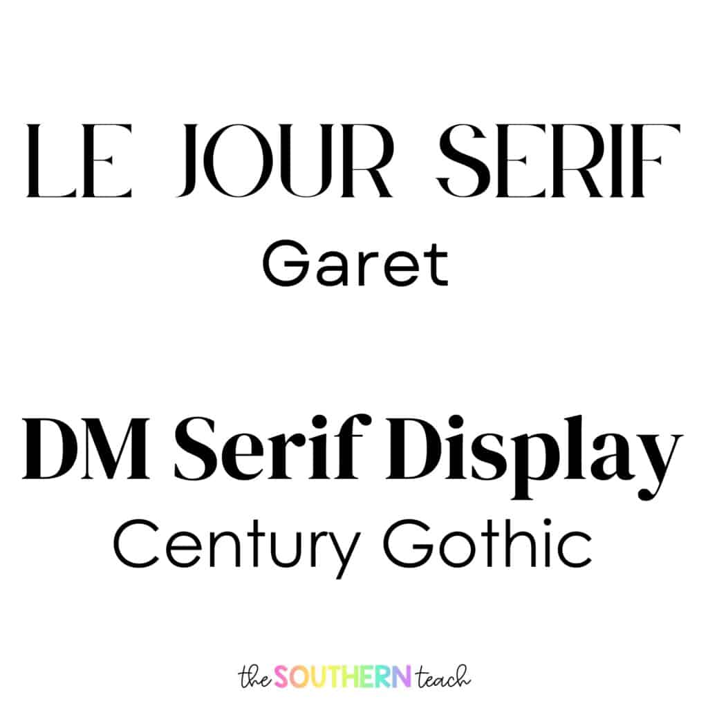
3. Pair a serif with a sans-serif font.
You’ll be surprised at how well this looks together!
One example is that you can pair a serif font such as Playfair Display and use that as a heading, and you can change the weight so you can make it more bold or less bold.
Then you can pair the body text with a sans-serif font such as Montserrat or Poppins. This makes a really cool, cohesive font!
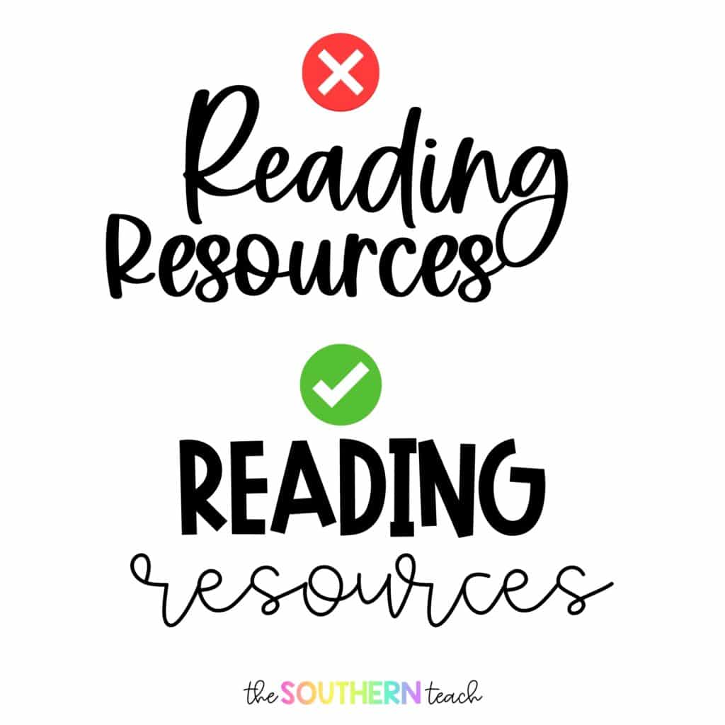
4. Avoid fonts that look similar
The last tip is the avoid fonts that look similar with each other as a heading and body text.
One example would be to combine two script fonts that look almost identical, that doesn’t look very good together. Another example would be to use two super classy fonts that don’t go well together.
Usually you can tell pretty quickly that there’s something not right with the fonts you put together. Follow that instinct.
Where can I find fun fonts for my classroom?
If you’re looking for any fun fonts for your classroom, I would suggest looking on TPT!
You can start by downloading fonts created by Kimberly Geswein. She is a popular font artist, and her fonts are completely free for personal use in the classroom. So when you download a font, you can use it an unlimited number of times in your classroom.
If you’re a TPT seller, you can invest in fonts for commercial use! Let’s say you have a KG font that you really love and you want to use that in some of your TPT resources, you can actually purchase licenses, and there are some TPT font artists that include the license with your purchase. If you buy fonts from them, you can get a license with that.
My big warning for you though is just to not go in a deep hole of buying all the fonts, because trust me, I have been there and it is not fun. It makes somebody who is super indecisive like I am even more indecisive!
Happy font pairing!
kirsten hammond
Kirsten is a former 3rd and 5th grade teacher who loves helping upper elementary teachers by creating resources and sharing ideas that are engaging, research-based, and TEKS-aligned. She is a work-from-home mama of 3 rambunctious little ones and loves running, true crime, and lots of coffee.